One of the most wonderful side-effects of a career as a creative artist is the opportunity to inspire younger generations. Giles Ward was recently approached by a young GCSE art student, putting together a project about art and the natural world and wanting to reference Giles’ work. Here are Giles’ responses to their thoughtful and insightful questions:
1) what is the thinking/painting process that goes into you creating a piece of artwork?
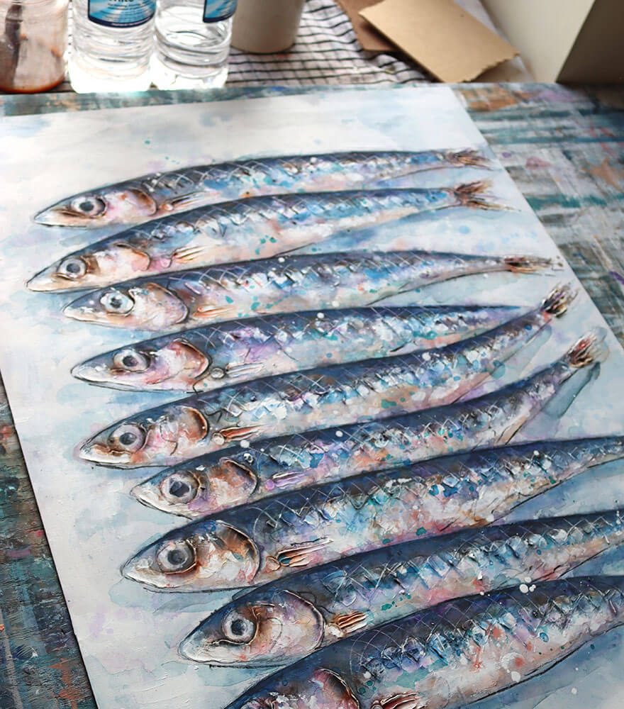
As you have identified I am drawn to the close-up detail of the natural world. At the moment that is sea creatures and shells. So, finding the actual fish, creature or shell is my starting point. I like to work from ‘life’ in the first instance so it might be a shell or stone I have picked up. If it is a fish or crab, I will buy them from a fishmongers, take them home and photograph them whilst the scales and eyes are still shiny! I then work from the photographs to design my picture, but most importantly so I can refer to the different colours and patterns. I love to experiment with paint and effects and use the photographs I have taken as loose reference.
2) how did you fall in love with the natural world/sea life and would you ever consider painting anything other than sea creatures?
I love the natural world generally and the detail of nature, in particular. I always have to pick up something when I’m walking on the beach or in the countryside. It could just be a little stone, but if you look close enough there is always something amazing to be seen. My love of sea creatures probably comes from holidays prodding around in rock pools. I don’t seem to be able to move on from sea creatures at the moment, there’s so much inspiration to be found. But yes, I love the colours and textures in all of the natural world. So, I very much want to explore the detail in other creatures – insects, ants, beetles, bugs and butterflies. But also in plants, flowers and leaves. Even something as simple as a tiny conker is a wonder if you study it for long enough. It’s not just brown – it’s orange, red, purple and dozens of other colours. I’m painting a couple of oyster shells at the moment and it’s amazing how much is going on in such a tiny little thing.
3) I love the neutral tones of your paintings (with the exception of sudden pops of bright colour!) and how in some you have used newspaper/pages from books? As the background – how did you discover this amazing contrast and do you prefer it to a whole colour background?
That’s very well spotted! Contrast is very important in my work. I love contrasting light and dark, pale colours and bright colours, flat surfaces and textures. With the flat coloured background images that I do I like the calm of the solid colour against the unpredictable chaos of the paint on the fish. This is reflected in the natural world where a background – sea, sky and earth – can contrast with the busyness of lots of colour within the detail of a tiny ‘thing’.
Thank you for your wonderful questions. Good luck with your project!